In this entries series I will show how to make UI elements that look like iOS ones. This includes buttons, tabs and toolbars. This approach is entirely based on HTML and CSS and calls for no image. The point is for these elements to be more lightweight and to display nicely on high density screens which otherwise require multiple images and multiple CSS rules.
The goal
The first one is the small blue circle showing when there is more than one action on a list - it usually goes to the "details" view of the element. There is also the small arrow indicating that a list item leads to another panel. Here they are :


You can see them both in context below:
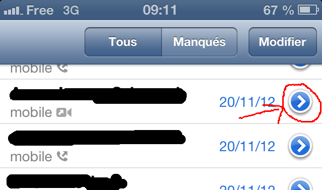
We have three distinct elements here: The outer white circle, the blue circle and the white arrow in the middle. Hence, we're going to use three distinctive DIVs to render this element:
<div class="detailIcon1"><div class="detailIcon2"><div class="detailIcon3"></div></div></div>
Method
The first div will display the outer circle:
It is made of a simple border and a box shadow and rounded corners.
div.detailIcon1 {
border-radius: 50px;
-moz-border-radius: 50px;
-webkit-border-radius: 50px;
overflow: hidden;
width: 23px;
height: 23px;
-webkit-box-shadow: 0px 1px 4px #666;
-moz-box-shadow: 0px 1px 4px #666;
box-shadow: 0px 1px 4px #666;
position: relative;
background-color: white;
}
The second one the blue circle:
That one is also made of rounded corners and a gradient background. Note the background has several steps.
div.detailIcon2 {
border-radius: 50px;
-moz-border-radius: 50px;
-webkit-border-radius: 50px;
background-color: #2670D8;
overflow: hidden;
width: 19px;
height: 19px;
position: absolute;
left: 2px;
top: 2px;
background: -webkit-gradient(linear, left bottom, left top, from(#2670D8), to(#75A4E6), color-stop(0.55, #2670D9), color-stop(0.6, #4D8ADF));
background: -moz-linear-gradient(bottom, #2670D8, #2670D9 50%, #4D8ADF 50%, #75A4E6);
background: -webkit-linear-gradient(bottom, #2670D8, #2670D9 50%, #4D8ADF 50%, #75A4E6);
background: -ms-linear-gradient(bottom, #2670D8, #2670D9 50%, #4D8ADF 50%, #75A4E6);
background: linear-gradient(bottom, #2670D8, #2670D9 50%, #4D8ADF 50%, #75A4E6);
}
At last, the third one will show the arrow. It's just the border corner of a div clipped and rotated.
div.detailIcon3 {
-webkit-transform: rotate(45deg);
-webkit-transform-origin: 50% 50%;
-moz-transform: rotate(45deg);
-moz-transform-origin: 50% 50%;
transform: rotate(45deg);
transform-origin: 50% 50%;
border-right: 3px solid white;
border-top: 3px solid white;
overflow: hidden;
width: 6px;
height: 6px;
position: absolute;
top: 5px;
left: 4px;
}
The results
Here is how it looks in your browser:
and the image of a screenshot (so, the real one):

I don't know for you, but that's close enough for me.
This method works on IE9 and 10, Firefox, Safari, Chrome, iOS, Android and Opera. And that's actually all I need. Note that on older Internet Explorers, it degrades somewhat nicely and doesn't look horrible, just odd.
The complete code
<style type="text/css">
div.detailIcon1 {
border-radius: 50px;
-moz-border-radius: 50px;
-webkit-border-radius: 50px;
overflow: hidden;
width: 23px;
height: 23px;
-webkit-box-shadow: 0px 1px 4px #666;
-moz-box-shadow: 0px 1px 4px #666;
box-shadow: 0px 1px 4px #666;
position: relative;
background-color: white;
}
div.detailIcon2 {
border-radius: 50px;
-moz-border-radius: 50px;
-webkit-border-radius: 50px;
background-color: #2670D8;
overflow: hidden;
width: 19px;
height: 19px;
position: absolute;
left: 2px;
top: 2px;
background: -webkit-gradient(linear, left bottom, left top, from(#2670D8), to(#75A4E6), color-stop(0.55, #2670D9), color-stop(0.6, #4D8ADF));
background: -moz-linear-gradient(bottom, #2670D8, #2670D9 50%, #4D8ADF 50%, #75A4E6);
background: -webkit-linear-gradient(bottom, #2670D8, #2670D9 50%, #4D8ADF 50%, #75A4E6);
background: -ms-linear-gradient(bottom, #2670D8, #2670D9 50%, #4D8ADF 50%, #75A4E6);
background: linear-gradient(bottom, #2670D8, #2670D9 50%, #4D8ADF 50%, #75A4E6);
}
div.detailIcon3 {
-webkit-transform: rotate(45deg);
-webkit-transform-origin: 50% 50%;
-moz-transform: rotate(45deg);
-moz-transform-origin: 50% 50%;
transform: rotate(45deg);
transform-origin: 50% 50%;
border-right: 3px solid white;
border-top: 3px solid white;
overflow: hidden;
width: 6px;
height: 6px;
position: absolute;
top: 5px;
left: 4px;
}
</style>
<div class="detailIcon1"><div class="detailIcon2"><div class="detailIcon3"></div></div></div>
Bonus
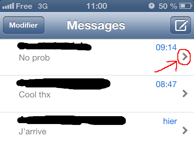
In bonus for this article, another element free of charge! I'm talking about the tiny arrow you can see below:
By now, if you've read the elements above, you know how to do it. Take a DIV, put a top and right border, rotate it. Easy queasy.
Here is how it looks in your browser:
Here is the code:
<div class="moreIcon"></div>
div.moreIcon {
-webkit-transform: rotate(45deg);
-webkit-transform-origin: 50% 50%;
-moz-transform: rotate(45deg);
-moz-transform-origin: 50% 50%;
-ms-transform: rotate(45deg);
-ms-transform-origin: 50% 50%;
transform: rotate(45deg);
transform-origin: 50% 50%;
border-right: 3px solid gray;
border-top: 3px solid gray;
overflow: hidden;
width: 6px;
height: 6px;
position: relative;
left: -5px;
margin: 0 0 0 auto;
}