Target your CSS fonts on different platforms

Continuing on my journey to find the proper set of fonts for my website, I was a little surprised to see the way the different vendors handle native fonts in CSS. In this realm, there are three players that handle both the OS and the browser: Apple (Safari on Mac OS and iOS), Microsoft (IE on Windows) and Google (Chrome and their default browser on Android). Their handling of the native fonts is — of course — different. Let's see the different approaches.
Let's start out with the simplest one: Android. There is one font, Roboto. You can target it with the following values: sans-serif, sans-serif-light and sans-serif-condensed for the different variants. There are a few aliases such as Arial (alias to sans-serif) or Georgia (alias to serif) but if you want to target Android you should add the serif-liked syntax for better support. Then you can use font-weight and font-style to target different weight and the italic version. However, you cannot target the sans-serif-light or sans-serif-condensed with CSS attributes. You have to select them with the font-family selector.
So, to target a narrow font, you have to use sans-serif-condensed you cannot use the font-stretch:condensed property. Less options is not good. One font is not good. This is not very rich.
Notes:
- This holds true for both Chrome and the abomination installed by default on Android.
- I haven't tested anything on Chrome OS. Common sense from a vendor perspective would say that it should be similar to Android. Common sense from a product placement perspective dictates that I find it doubtful that a desktop OS would ship with so little fonts installed. All bets are open.
Microsoft
IE allows also the font-stretch to be used, along with the name of the font — if at all available, which is rare. For example, you can target font-stretch:condensed;font-family:Arial or directly font-family:"Arial Narrow", both work. Unfortunately:- there are not even a handful of fonts with condensed versions
- none are installed by default, they're installed with MS Office
- no other variation than condensed can be targeted (save the Arial Black oddity which quite doesn't work as expected — see below)
- most fonts are crap anyways
font-weight and font-style work as expected but for the fact that all fonts have only two weight available. Again, Arial Black is the exception, giving one more weight to the Arial family. But if you target it with font-weight:100 (trying to get a thinner version) well, you still end up with Arial Black.
So despite its interesting support for different types of font targeting, IE falls short because of the lack of unity and the lack of nice fonts. While testing, be also aware that not all windows users have MS Office installed, so if you do try to find a machine that doesn't to test your fonts on. MS Office comes along with a bunch of fonts and not everyone has them. This is unfortunate because those are nice fonts...
Apple
Safari doesn't support the font-stretch CSS property so far. To target a narrow/condensed font, you have to target it with its family name. The surprise on both iOS and MacOS is that you can target all variations of most fonts by their family name. Italic, light, black, bold, condensed, every variation has a family name you can target right in the font-family CSS attribute. Now, apart from the stretch, you can also target those with font-weight and font-style. For example, if you specify font-weight:600;font-family:Helvetica-Light, you'll get the regular Helvetica (the bold version of the thin font). With font-weight:700 you'll get the bold version. This is the best of both world, really. Whenever Apple starts supporting font-stretch, Safari will be the sweet spot for font selection. But as it is, it's already the best.
Moreover, Apple's (modern) fonts are declined in a variety of styles (like 5 different thickness; light, thin, regular, medium and bold) allowing better control, and they are pretty nice. So — somewhat unsurprisingly — most sites having paid attention to their fonts and relying on native font stacks will be rendered best on Apple devices.
Mixed platforms
For Firefox, well, things look very much like Chrome. It also depends on the OS. For example, trying to target Arial Narrow on Windows has to be done with font-stretch:condensed;font-family:Arial, but on Linux for example, you have to use font-family:"Arial Narrow". font-stretch:condensed; doesn't do anything on Linux.
How to test?
Testing, as always, is the right thing to do. I've set up a small page that list the fonts available on your browser. You can access this page from an iOS, Android, MacOS and Windows machine to see the fonts available. Then you can build your font-family stack with reasonable confidence. If you don't have all of those machines available, hop on to saucelabs.com to access some of those machines for free. Test the fonts on your browser
All in all, I have found that the worst platform to find fonts for is Windows. But in every case, I've found fonts that I liked for every system without much work. @font-face is not yet something I will consider for any of my websites.
Chrome and Arial Narrow
As you discovered with my previous entry, I was looking for nice condensed web fonts (read: native) for my headings. Well, I found plenty for everyone but for Chrome on Windows. Chrome issue is troublesome for me because this combination represent 30% of my traffic right now, by far outweighing other combinations of browser/OS.
How come I couldn't do it? I could do it with IE, Firefox on all platforms and Safari on all its platforms. Even Chrome on non-Windows platforms. It turns out that Chrome does not support the font-stretch: condensed CSS attribute. On other platforms, there are fonts that are condensed and can be targeted by using their name, but alas, Arial Narrow is not a font you can target with Chrome (nor with Firefox), even though IE can target it. Note that Franklin Gothic is in the same situation.
It's the first time Chrome is lagging in terms of features behind IE and Firefox (at least on something I use).
Let's hope Google addresses this problem as Arial Narrow is pretty much everywhere. And it's a pretty nice font, even though Helvetica people have probably left my website by now.
Edit on October 16: It is an issue with Chrome 37. So hopefully it'll get patched soon.
Edit on October 21: Chrome 38 is out. This is fixed.
The quest for a condensed web font
I was looking to freshen up my blog's CSS. It's that time of the year. After looking here and there, I decided I wanted a condensed font for my headings. Sans Serif. This seemed like the right thing to do.
A condensed font is a font that is a little narrower than a regular font. For example: 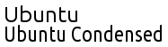
As you can see, the letters are stretched and narrower than the regular version of the font.
I want a web safe and native font-stack because it is much lighter than a font-face (download-wise). You now see everywhere on the web that there is no point in targeting web safe fonts, because there are too few. So just use the CSS3 @font-face and be done with it. Well, I don't agree with this. I still care about my mobile users and imposing them a 100kB payload just to view the headers in the font I chose is not something I think is reasonable. Plus, I like the idea that my website looks a little different on every device. Hopefully it even matches the UI of the device since its using one of the device's font. I mean, using the Ubuntu font on an Ubuntu system is more likely to trigger a familiar feeling to the reader. This font is displayed in quite a few places in the OS such as the splash screen or the menus. And it seems fun.
Of course, I want my font-stack to be cross-browser. So I looked for default fonts on all my target systems. Fortunately, in my home there are plenty of different devices: iOS, Android, Windows, MacOSX and Ubuntu (Linux). This is my target right there.
The Quest
On Ubuntu, there is a nice font pre-installed called Ubuntu, and there is a condensed variation. In bold it looks fine. I also found a Liberation Sans which also has a condensed version (called Narrow). There's a better chance of having these fonts on non-Ubuntu Linux boxes. Since I couldn't find any resource on the web telling me which fonts are preinstalled on an Ubuntu system, I made it with the fonts installed on mine. Also, testing with saucelabs.com I found that their bare Linux install has Liberation Sans installed. I'll call it a day.
Then I went to iOS, where a very nice website lists all the fonts on all the versions of iOS: iosfonts.com (best viewed on an iOS device). I found two fonts that I liked in there: AvenirNext (since iOS6) and Futura (since iOS3). So there I am, iOS is now covered. The extra bonus is that for old devices I will fallback to Futura and all iOS devices can install iOS3, so I've pretty much covered 100% of iOS devices. Sweet.
Then I went to Android, where there is a new font called Roboto (as you can see there). This is unfortunately only true for recent Android devices (how recent I don't know), but it seems to me that there was no condensed font installed before that point. Too bad. There is also something peculiar about Android font families: You cannot target font-family: Roboto. This would be too simple I guess. You instead have to target a generic condensed font: font-family: sans-serif-condensed. Oh well, after all what I'm looking for is a sans serif condensed font and if/when other browsers on other platforms start picking up this peculiar syntax, well, it'll give me what I want. I guess. I hope.
I went quickly to my wife's MacBookAir, just long enough to make sure that one of my iOS fonts was installed on her Mac: Futura. They also make available a list of fonts for their OS: ht1642. The wikipedia page is much more helpful in that it has images of what the fonts look like. So I found Helvetica Neue which has a nice CondensedBold version. There I was. Done for MacOSX.
Then I went to Windows, my least favorite platform but let's face it: The one used by the vast majority of my users. I was firmly decided to get it done quickly. More than 90% of my users come from Windows 7 or 8, so I went to the Win7 fonts page. And there is the real disappointment: no condensed or narrow fonts. The narrowest font I could find is Trebuchet MS, the font I was already using for my headings. Disappointed. Very much so. So I thought that most users having Windows have Microsoft Office. I then stumbled on this page: Fonts supplied with Office 2010. There I got plenty of interesting fonts. Unfortunately, I tested this on my son's Windows 8 laptop with Office 2013, but most of the fonts listed weren't even installed. Too bad.
Then, wandering on the fringes of the interwebs, I stumbled on cssfontstack.com where I discovered a few things:
- There is a font called Arial Narrow. It works on my ubuntu even though it's not even on the installed fonts list!! Let me try that on windows... Well, things are complicated. On IE, you can target it fine either by putting Arial Narrow or by targeting Arial and specifying font-stretch: condensed. Firefox only goes with the font-stretch: condensed and Arial. Chrome as well (doesn't work on Chrome 37 though). So I'll put it with both forms as a fallback.
- Franklin Gothic Demi Cond seems to work on Windows and looks a lot nicer than Arial Narrow. Firefox and Chrome let me use the font-stretch: condensed modifier which does the job on Franklin Gothic. With IE, it works both ways. Unfortunately, I've found a few systems with Arial Narrow which don't have Franklin Gothic Demi Cond, so I cannot target it for Firefox/Chrome or else Firefox will just display Franklin Gothic, not the condensed version on those systems.
- Both these fonts are installed with Office, none are on a bare Windows install. Furthermore, to target Arial Narrow for Firefox and Chrome, you need to target Arial with a font-stretch: condensed. Hence, whether Arial Narrow is installed or not, Arial will be targeted and your font stack stops right there, because this is such an ubiquitous font. Since most Windows users have MS Office, I will still try to target it. And the rest of them will see Arial.
The Results
Here are my results so far:
Since most of the fonts I found do please me, I listed them in no particular order, except for
- My old fonts are at the last position as a last resort fallback.
- Android's declaration seems a little too generic for me, so I put is just before the fallback fonts in case some future version of browsers start interpreting it giving me unexpected results.
Final thoughts
Finally, I've got a few surprises in my quest.- iOS and MacOS are much more polished environments than the rest and finding nice fonts was just plain trivial. There are lots of documentation and examples, and devices follow them nicely.
- I thought a modern OS like Android would be more loaded with fonts and would have a better documentation.
- Ubuntu is an undocumented pile of heterogeneous stuff. Linux. No surprises there.
- I did not expect Windows to fare particularly well in here, but I certainly didn't expect it to fare that bad! Not only is the documentation just plain fuzzy and wrong, but the font choice is the worst of all OSes. To put it bluntly, it doesn't have a narrow font, not even in Windows 8. And to think this is the major desktop OS by far... I'm not wondering why MacOS shares are increasing.
And, as expected, no need for a @font-face declaration and a 70k download just to get a font I like. Most Windows users have Office installed (I hope) so this isn't a really big issue. Plus, Arial isn't that bad as a fallback. My font stack works well enough in all platform I've tested so far. That's more than enough for me.
At last, check out flippingtypical.com. It will list all the fonts your browser knows about with a nice preview. Very helpful.
The Demo Area
Here are all the fonts selected. You will see of course only the ones you have installed on your system. This is more of a test area for me than for you, but I threw it there so that you can see it. Note: I built a little tool to help you detect all the fonts you can target. Test the fonts on your browser- No style: All examples looking like this below means they don't exist on your system.
This is the test area - iOS6: Avenir Next Condensed Bold
This is the test area - iOS3: Futura Condensed Extra Bold
This is the test area - MacOSX: Helvetica Neue Condensed Bold
This is the test area - Ubuntu: Ubuntu Condensed
This is the test area - Ubuntu: Liberation Sans Narrow
This is the test area - Windows: Franklin Gothic
This is the test area - Android: Generic Sans Condensed
This is the test area - Fallback: Arial Narrow
This is the test area - Fallback: Trebuchet MS
This is the test area - Fallback: Lucida Grande
This is the test area - Fallback: Tahoma
This is the test area - Fallback: Verdana
This is the test area - Fallback: sans-serif (This is the last instruction - I want a sans serif font if nothing else is available)
This is the test area
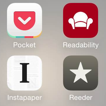
Reeder and its companion apps: Readability vs Pocket vs Instapaper
Reeder has always been my favorite app for reading my multiple RSS feeds. Simple and elegant, it allows preloading of all your feeds so that you can read them in the subway for example.
RSS feeds are usually short summaries of blog entries, and almost all major news website has some to help follow their news stream. While some sites deliver the entire content of their articles to their RSS feeds, most only send a shortened version. Users that want to read the full story click on the link and get to their website. Of course, only if you're reading it online, which is not always my case. Also, if the article is long, you may want to save it for later. Keeping a tab open in your browser is not a great way to do that. Also, an RSS reader is a poor place to keep something for long. You usually consume what's in there pretty quickly. The flow is constant and uninterrupted.
So, for articles I want to read whole, I'm sending my content to one of three apps: Instapaper, Readability or Pocket (formerly known as "Read It Later"). All three apps are made for viewing curated web pages offline. They keep a "reading list" of all the stuff you sent to them, so it is convenient to come back later to these apps and read your stuff.
They also "curate" the web page you send them in order to remove ads, menus, headers and such. this mostly work for all three apps.
So, which one is the best? Well, this is all a matter of perspective and preference. Here are mine:
 Readability
By far, the most elegant of all three apps. I do have a few grudges against it:
- One can only read by scrolling and not by paging. Unfortunately I prefer paging by far. Just like I prefer paging when I read a novel in iBooks, I prefer paging when reading any long piece of written content.
- You can only choose between three fonts. There are plenty of fonts installed on iOS, why not propose them?
- The choice of font-size is... Well... not fine grained by any means. There are 5 predefined sizes. Of course, the size I would like is between two of the sizes proposed.
- You can only read in portrait mode, not in landscape mode. I like landscape because it shows me longer lines.
- Clicking on a link jumps straight to Safari. Isn't (one of) the purpose of this app to be able to read offline? Not practical at all.
- As many images are also links, it is more often then not impossible to zoom in on an image. The click will jump to Safari to open the link. Useless offline.
- An inline video in the article does not show up in the curated article. You don't even have a hint that you're missing something.
- The reading list gives you the number of minutes it'll take to read each entry. This give you a pretty good sense of how long the entry is.
- Best UI of the lot, very homogeneous and smooth. This is important.
- for example, when you increase font size, it applies to the body and the title of the article. This is the only app doing that.
- it is consistently downloading all images of all articles.
 Pocket
The bad parts:
- Pocket has a presentation of your reading list that bewilders me. The title is written on the left and an image is displayed on the right hand side. This makes it looks just plain weird as sometimes the images are ugly and some articles don't even have one. And all entries have different height in the list making difficult to differentiate them sometimes.
- On the reading side, the page-by-page mode is a bit hit and miss. To activate it you have to swipe from the right to the left, but this gesture is often confused with just plain scrolling. When going landscape, the page-by-page mode goes off and you have to activate it again.
- The page-by-page mode has also a disturbing quirk: when you tap in the middle of the screen, it shows the header and menu bar at the bottom, which is customary. But in Pocket's case, these bar overlap the two last lines of the screen which then disappear. Thus, if you go to the next page, you are missing out on 2 lines of text (not drawn) for each page. When you tap again to make them disappear, the hidden text doesn't come back. You have to go to the next page and then go back. This is disturbing.
- In page-by-page mode, you have no idea of your progression in the article you're reading. No scrollbar, no progress bar, nothing.
- There are only two fonts available. Still better than one, but come on! This app is dedicated to reading, let us choose fonts!
- Playing with font size doesn't affect the title of the article. You can end up with a title smaller than the body of the article. Not very elegant.
- I also have images that won't get downloaded. On some blogs/sites it is even almost always the case. There's just nothing in their place... you don't even know you're missing something.
- Clicking on an image opens it up and you can zoom in.
- When you have a link in an article, Pocket will propose to open it as if it was another item in your reading list. So you don't have to quit the app to read it. But it doesn't get saved in your reading list. Of course also only works if you are online, defeating the purpose of the app. Couldn't I "Read It Later"? And to think the app was once named exactly like that...
- You can choose your font size point by point.
- An inline video in the article actually show up in the curated article. Of course, you cannot read it offline, and that one is understandable.
All in all, this is the less elegant app of the three, but it gets the job done. And it handles videos - it is the only one.
 Instapaper
Here are my grudges:
- The reading list is written in a tiny font and the excerpt in an even tinier font. And there is nothing you can do about it.
- On the reading side, the page-by-page is a bit needy. If you go from landscape to portrait (or the other way) you have to quit your article and open it again for it to work, otherwise it's just plain clunky.
- The page-by-page view is a bit buggy and below images there is sometimes a chunk of text outside the screen that you can't read. It doesn't happen very often though... Also, images are scaled to take the full width of the screen. If the rescaled image is higher than the screen, it is cropped. Not much of a problem when reading in portrait mode, pretty ugly when reading in landscape mode. Fortunately, you can click on an image to see it full screen and zoom inside it, so it is just impractical.
- Playing with font size doesn't affect the title of the article. You can end up with a title smaller than the body of the article. Not very elegant.
- I've also had images that would not be downloaded inside articles. It is pretty much consistent and no matter how many times I try to redownload the article, they're always missing. These are the same images missing from Pocket. Readability displays them fine. I couldn't figure out what makes these images not work in those apps. The good thing is that Instapaper displays the ALT/TITLE property instead (usually, the tooltip), so you know something is missing.
- An inline video in the article does not show up in the curated article.
- Clicking on an image opens it up and you can zoom in.
- In your reading list, you have a sense of the length of each article and this is a definitive plus.
- You can choose among a 14 fonts (why not all the fonts installed on the device? - this is a mystery)
- Clicking on a link gives you the option of opening the target in Safari or adding it to your reading list. If you're offline, well, it'll get added later. THIS is the proper way to handle links.
- The reading view is elegant - just like the other apps - and there is a progress bar at the bottom. This is cool.
- You can choose your font size point by point.
- You can choose your margins and line spacing.
- There is a link at the end of all articles to report a problem in an article such as a missing image for example.
- The page-by-page navigation is the best of all three apps, despite it bugs and quirks. For example, it allows you to tap on the right of the screen to go to the next page, instead of swiping which is more tedious after a while when holding the phone one handed.
Wrap up
All in all, those three apps get the job of reading articles offline done. They also curate the webpages displayed to remove the chrome and other useless stuff. This works mostly for all three of the apps. I've had a few glitches here and there on all three apps.Except Instapaper, the apps are free, so please indulge yourself and give them a shot.
For me though, Readability shines by its elegance and design, and also because it is the only app that works... Indeed, most of the grudges I hold against both other apps are a long list of bugs. Instapaper shines for my by its functionality. So far I'm using Instapaper and sometimes Readability to read stuff with images. If I didn't need page-by-page reading, I'd be a Readability-only guy.
I'll try to update this blog entry as the apps get updated. If you see anything I should add or remove, please let me know in the comments.
Changelog
October 10, 2014: Both Readability and Pocket were updated yesterday. Now, all three of the apps are compatible with the big new iPhones (6 and 6Plus) and compatible with iOS8 sharing, meaning you can send them pages from any app. None of the issues I mentioned in my article were addressed.
This article was last updated on November 3, 2014